Photography is not just about clicking pictures, It is also about colour psychology.
Understanding the colours and using them correctly in the photographs and videos is what it means.
This can have a powerful impact on your photographs and videos.
Colour psychology is getting a deep understanding of what colours make you feel.
It includes choosing what particular colours in images can portray which mood or emotion for the subject in front of the camera and the audience.
This can be like a visual language that the photographers use to elicit certain emotions and reactions in the spectators.
If you are trying to improve your work in photography or are just beginning your career in this field, understanding how colours work and how to use them effectively in your work is an absolute must.
Let us learn in-depth about colour psychology and how it all works in Photography…
Why do we need colour psychology?
Colour psychology can enhance the mood of the images and present emotions and a message through them.
By correctly using the colours in the pictures, you get a hold of the feelings and emotions that the image will portray in the end.
If you do not consider the colour theory, the message you want to give the audience might change.
For example, using cold and dark colours in the portrait of a newborn baby might change the emotions.
It might contradict the expected joyous and happy feeling of the birth of a baby.
Have you ever loved a picture and found it captivating but could not figure out why?
Apart from using the exposure and lighting correctly, you can notice that the photographer must have added a touch of colour theory while clicking the photograph.
Colour theory or psychology plays a crucial role in photography.
But there are still a lot of photographers not familiar with it.
Cinematic presets of various types are available in many photo editing apps and sites that you can use to create a particular mood in your photos.
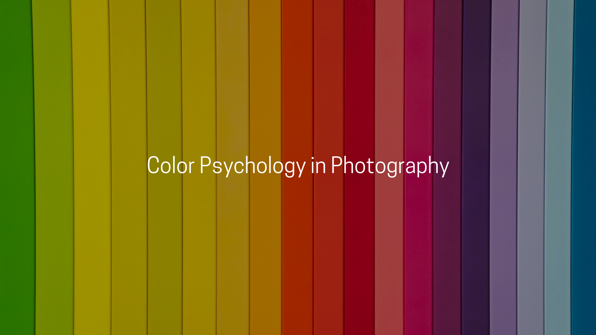
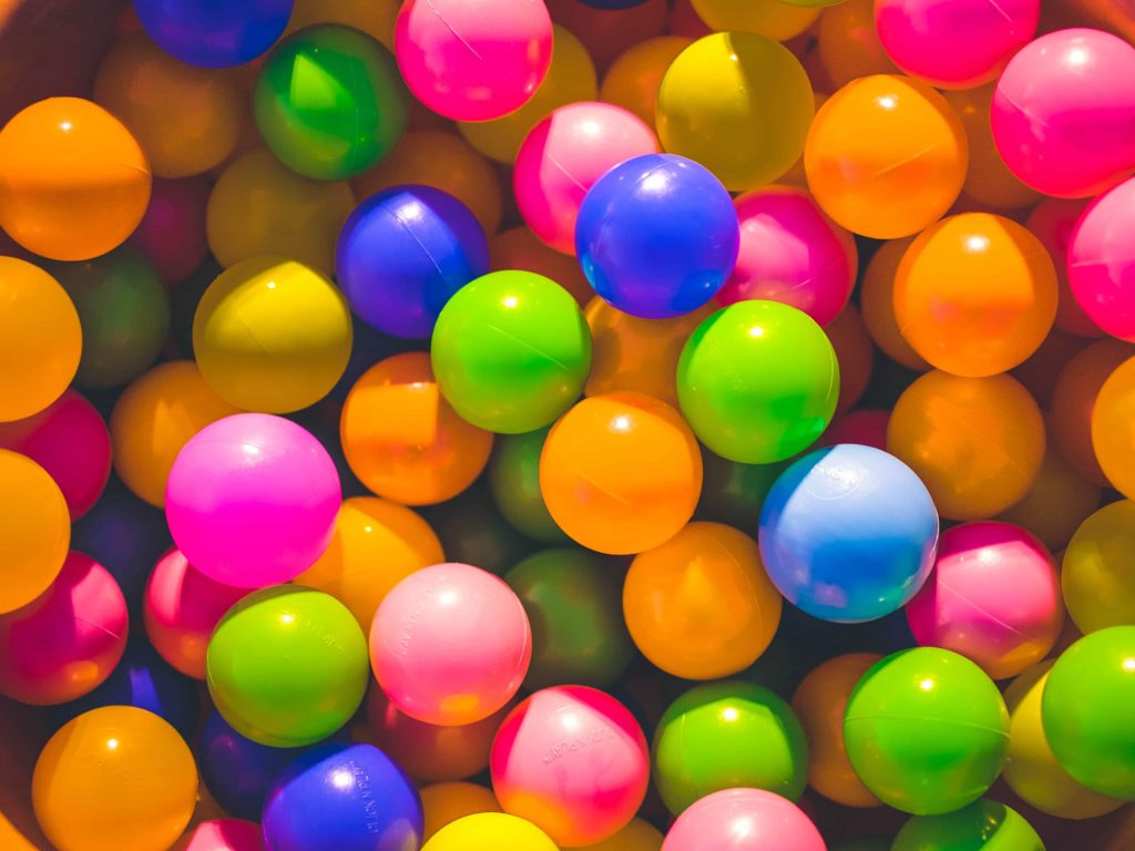
Colors in photography
You can not change the colours in front of the camera and the surroundings of the subject.
But the effect can be enhanced or reduced accordingly during post-processing.
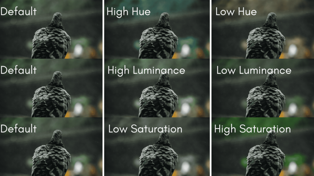
You can do it by playing around with lighting, saturation, and hues.
Check this example below to understand the effect of Hue, Luminance and Saturation on one single image…
The meaning of colour can be affected by geography, colour, time of the day, gender, and many other factors.
That is why a single colour can have several meanings. Let us discuss the significance of the most common colours used in colour psychology.
Red
We all know the colour red stands for love, passion, anger, danger, etc.
It is an emotionally intense colour.
Red is very effective, mainly used against a dark frame.
Therefore you must use the color meagerly.
Pink
Pink reminds us of joyfulness, and cheerfulness and has a strong feminine quality.
It is associated with romance and tenderness as well.
If used in an excessive amount, it can also portray vulnerability and weakness.
Green
Green is a very positive colour.
It is associated with greenery, nature, prosperity, and harmony.
This colour is considered stress-relieving.
Yellow
Yellow has the highest luminosity level and is known to be a colour of brightness, warmth, happiness, and wealth.
Black
Black is a colour comprising both the negative and positive aspects.
It is linked directly to sophistication, elegance, death, evil, power, etc.
The colour black can sometimes stimulate strong emotions that can be too overwhelming sometimes.
White
White is associated with elegance, peace, purity, strength, and peace.
It links with the clarification of all the negative thoughts and fresh beginnings.
How to use colour psychology to create a dynamic image?
Colour psychology is the understanding of colours, how they affect human behaviour and what they perceive out of that image.
It is used in marketing and also plays a huge role in branding.
This can even have an impact on the final decision of the consumer.
Many apps and sites provide some built-in cinematic presets.
Paid presets of a wide variety with a wide range of colours are also available on various websites and software.
Hue, saturation, and luminance (HSL) are the three variables of colours.
These variables can enhance your images and make them look even better and effective.
It helps the photographer portray the emotions in a much better way.
Conclusion
Colours help you to impress the viewer.
No matter if you’re taking shots that include some outstanding colour combination or adding colour during an editing session.
But as a photographer, colour psychology is a very important stuff to learn.
You can make viewers sad or happy by just adding/applying different colour combinations.
If you want to edit your images and alleviate their look, you can get the best presets and cinematic luts.
It can add a spark to your image without putting in a lot of effort.
May you like
- 7 Proven & Unique Ways to Earn As Photographer
- 10 Sharp & Easy Editing Tips To Make Any Photo Look Professional
- Top 17 Photography Hacks You Should Know And Master Right Now
That’s all you need to know about colours if you’re a photographer and want to express your photos differently.
Which colour do you love the most to add to your images while editing?