Colors are a very important part of every single image because without understanding the colors we can not make our images look more interesting.
so that means if you have proper knowledge of color combination while capturing or editing your images then you can make something good out of it.
for every photographer, color theory is very important to make their images look alive.
do you know how to manage all the colors and lights while shooting??
if your answer is NO then this article is just for you, or even if you want to capture amazing portraits then this article also helps you to know something more interesting about it.
now without talking more about it, let’s get started…
Beginners guide to color theory in photography
when I started capturing images with my camera, at that time I didn’t know anything about color theory.
and personally, it’s very boring to learn all that stuff, because I don’t know the importance.
but now I know something about color theory in photography, and I think every passionate photographer must need to know and learn this thing.
In this article, I’m just sharing some important parts of color theory which you need to remember and use while you’re shooting.
I’m not sharing each and every part in depth ( because it’s boring for me and you also ).
so here are some cool things you need to know about colors…
Basics of colors…
here are some basic things you need to know before we start…
Hue
this is the first point for color theory in photography which you need to know.
do you know anything about RGB colors? there are prime colors and the RGB model is mostly used in photography.
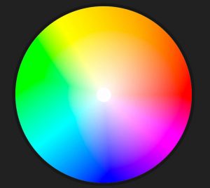
as you know the simple meaning of RGB is Red, Green, and Blue, which are the primary colors & the above image is just a combination of these prime colors which is called as hue.
it’s the natural color, which we get while we just capture an image.
using these three colors you can create any of the colors like pink, yellow, cyan, etc…
Brightness/Lightness
I hope you know the basic meaning of Brightness.
In photography, we use brightness to see the balance of hue, it’s bright or dark.
if it’s dark that means our image is underexposed, and if it’s very bright then our image is overexposed.
example of underexposed and overexposed images…

example of an overexposed image

example of an underexposed image, credit Flickr
if you want to learn how to manage these scenarios then please read the article on ISO and Shutter-speed.
Saturation
so saturation is a kind of percentage, which starts from 0 to 100.
let me show you one simple example of a saturation color from 0 to 100.
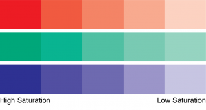
as you can see the origin colors started from a high saturation point means 100 and in the end, it reaches to low saturation point.
now let’s talk about some best way to explain or add colors in our photographs…
there is a total of three ways which you can use to capture better images by playing with colors…
these points are also called as color schemes.
- Complimentary color
- Analogous color
- Monochromatic color
Complimentary color
complimentary colors are the combination of two colors or we can say one pair of colors in one single picture.
but the main thing about complementary color is that one color must be the opposite of another one.
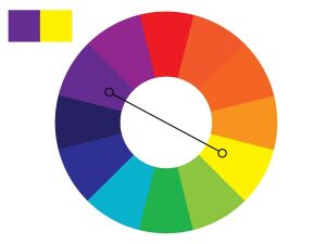
here in this image we first selected yellow and in the opposite, we get the purple.
that’s how the logic of complementary color works, I don’t know why but somehow it works to capture better images.
some of the most used pairs are red and green, blue and orange & yellow and purple.
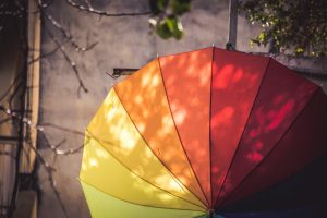
find some real examples of complementary colors.
Analogous color
analogous colors are the combination of next to each other colors.
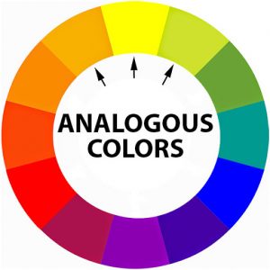
you can pick any one color and select the next two-color, so you’ll find your perfect color pallet for the shoot.
The best color combination of Analogous colors is red-orange-yellow, green-blue-purple, etc…
here is an example of Analogous color…
Monochromatic color
This color scheme uses only one color, or you can say one hue with different shades.
and as an example, we selected the color red, and here is it’s monochromatic color pallet.
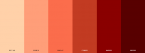
you can capture one single image which contains a color combination of dark-red, red or light red, as mention in this image.
this one is my favorite image which is the best example of monochromatic color…

as you can see this image contains different shades with one single color.
captured using canon 1300D, check out more examples on my Instagram feed…
that’s all from my side, hope you guys like this article, and learn something new about color theory in photography.
May you like
- 10 Sharp & Easy Editing Tips To Make Any Photo Look Professional
- 8 Popular Photography Myths To Avoid For Better Photographer
- Learn Rule Of Thirds In Photography Under 5 Minutes
have a good day, thank you 🙂


1 Comment